Duolingo's Energy UI
A Kinetic Teardown mapping the friction between monetisation and user momentum.
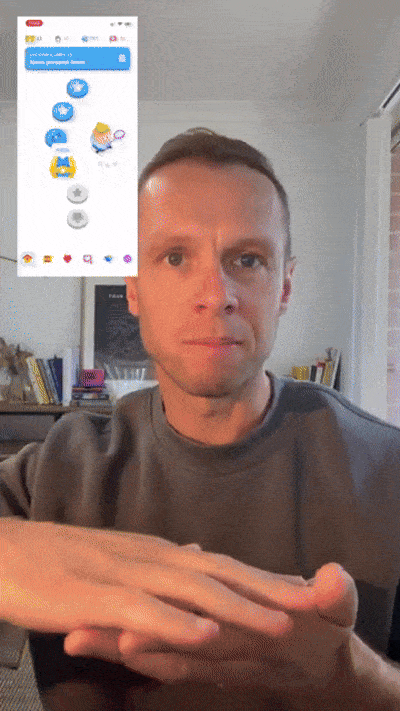
"Users are complaining they don't understand how much a lesson costs anymore. We need you to tear down the new energy UI, specifically the depletion animations and the refill screen because drop-off is spiking. We need some actionable improvements to make this feel intuitive again."
The Diagnosis
Duolingo wrote the book on gamified learning, but this new update is killing user momentum. It’s a classic case of putting monetisation first - forcing rigid paywalls and other tactics into an experience that needs to be fluid and match the energy of active learners.
When we run their UI through our scorecard, the numbers don't lie. Demand is still solid, but user Velocity is way lower than expected for an app of this type, at 22.5. It takes users way too long to understand this new economy. And Friction is sitting at 50, meaning the interaction cost just to restart a lesson is way too high.
The Quick Win
To patch this leak today, they need to combine the energy bar with the lesson progress bar. Stop showing a raw number in the battery if they don’t explicitly show what lessons are going to cost (in energy). Divide the bar into visual cells, where one cell equals one lesson. Let the UI do the maths, so the user can just glance at it and keep learning.
Is your product making these exact same structural mistakes?
When you fight the digital environment, the environment always wins. Get your custom roadmap today.
Order a Kinetic Teardown ($249)A roadmap your engineers can actually use.
We skip the bloated 40-page slide decks and endless discovery calls. For $249, you get a complete execution package delivered in 24 hours:
- →The Context VideoA private screen-recording walkthrough where we physically show you exactly where the UI is fighting your users.
- →The Notion DashboardAn operational workspace quantifying your friction scores, laying out architectural fixes, and providing a step-by-step roadmap to hit your target metrics.
Surgical precision for your biggest bottleneck.
A Kinetic Teardown is a high-speed, targeted diagnostic. "Kinetic" means energy in motion—point us at one specific problem or core flow, and we'll show you exactly how to get your users moving again.
Onboarding Flows →
Diagnosing the leaky bucket between signup and first value.
- Registration funnels
- Paywall friction
- First-time user experience
Product Design →
Diagnosing cognitive overload in the core app experience.
- Figma prototypes
- Core app features
- Design systems
GenAI Prototypes →
Diagnosing usability and hallucination risks before you ship.
- Chat interfaces
- Copilot workflows
- Prompt environments
No discovery calls. No slide decks.
Here's how the process works.
Submit your link
Drop your live URL or Figma file, and point us at the specific flow, prototype, or bottleneck.
We audit for structure
We run the experience through our framework to pinpoint exactly where the architecture fights the user.
Deploy the fixes
Your Context Video and Notion roadmap hit your inbox in 24 hours. Hand it directly to your product or dev team.

Hi, I'm Elwood.
Design Director
I started RDC to move digital products beyond subjective design opinions and legacy frameworks. My goal is to perfectly align your users' context with your system's environment. When you order a Kinetic Teardown, I personally oversee each audit to pinpoint exactly where users are becoming stuck, and give you the roadmap to fix it.
Frequently Asked Questions
Is this just standard user testing?+
What if I want an audit of my entire app?+
What if my app is behind a paywall or login?+
Do we need to jump on a discovery call?+
Align your product with your users.
Provide a core flow or bottleneck for us to diagnose. We’ll deliver your video walkthrough and structural fixes in 24 hours.
Usually $499 — 50% OFF MVP Launch Price
Money-Back Guarantee: If we don't find at least one structural fix to improve your flow, we’ll provide a full refund.